 |  |
|
I don’t know how I feel about this project. I find it interesting yet not in the same way. It was probably really fun to do, and would be cool if it was ongoing. I guess what makes it less interesting is how facebook is close to obsolete, at least towards the general population it is. I do like the concept, though. I feel like it could be stretched out or branched a out a bit more. I don’t know if I’d classify this as “dada”, considering that it feels like art. It might bring into the question of “what is high art vs low art” but it’s interesting that he felt inspired from that. The topics that are addressed in the concept is intriguing. There’s so many questions that are raised. It shows what we thought about with the rising popularity of social media. Personal space is questioned, and his project definitely made users more aware of the content they posted. Overall, it was very effective. I think this might be interesting to do, or at least compile a lot of weird or interesting posts together that people post at times. I feel like doing so will bring more awareness to the constant things we do, or the flaws in our social media society that we have made.
The project will be that I'll be making an instagram that have artists collaborate to create a larger piece. I want it to be simple things, so that non professional artists can do parts, too. Hopefully this will turn out well, the only problem will be what topic to decide on.
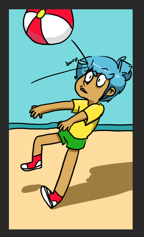
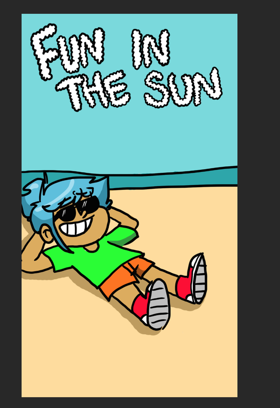
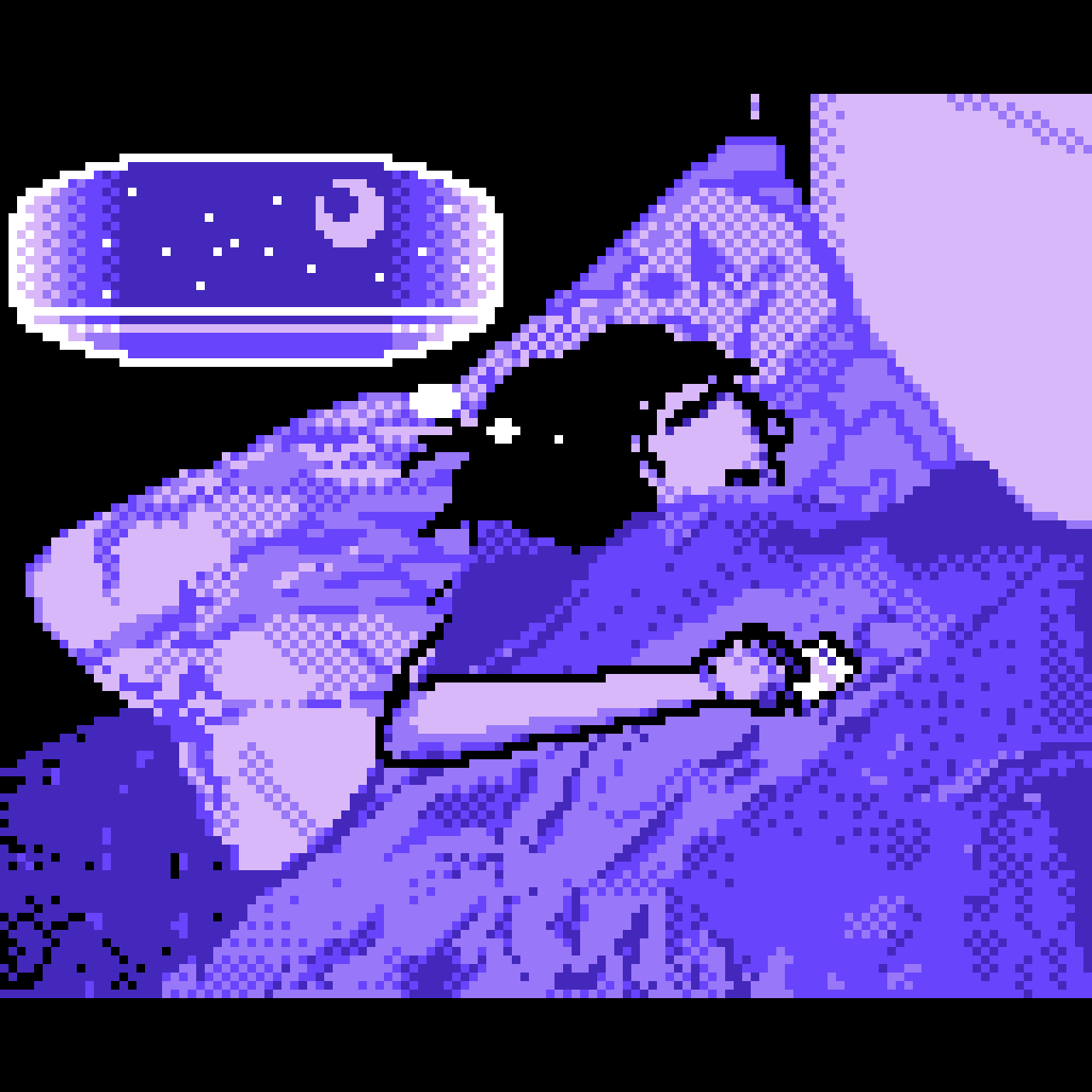
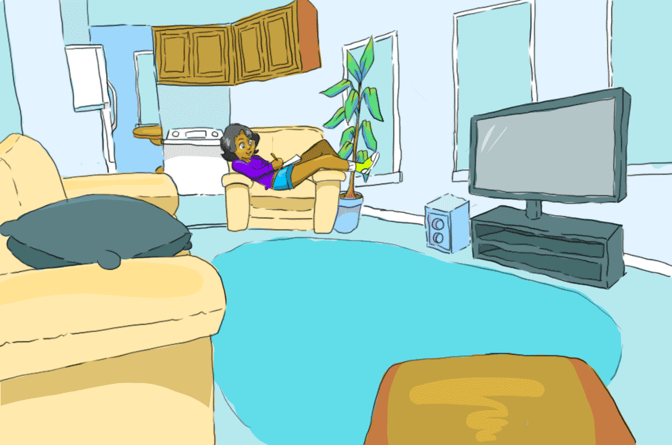
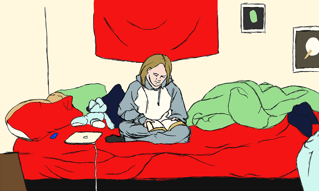
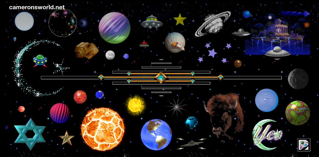 I had found this website a while ago and fell in love with it. I’m actually happy have been able to find it again. What I really like about it is the vintage type aesthetic there is to it, it has an odd nostalgic tone that alludes to something that I do remember but have never experienced. I also enjoy the composition of it, too. Each section relates to not just an aesthetic taste/color, but a theme, too. I enjoyed how much detail and color was put into each and every part of the website. There was no spot that was lacking. The music played in the background was also fitting. It had a feeling of how people in the past thought about the future, which i found entertaining. Lastly, I thought it was interesting how some of the images linked to the website sources. It wasn’t like every picture was, so it wasn’t as overwhelming. It was cool to have a look into everyone’s lives, though, and I wish the website that the person got the sources from was still up so i could see more pages like this. I didn’t have much time to look through every detail of the website, but I really want to take an afternoon to do so, and I’m pretty sure I’ll put this in my “inspiration” folder so I won’t lose this link again.   The piece, Tired, is related to the concept of self centeredness in the american youth. It is not as symbolistic, but more related to the piece as a whole. Although the animations are very busy, they are still centered around the person in the center. I wanted to explore the concepts of symmetry and 3D effect. I looked up a few strategies of adding a 3D effect, one being shifting the image and the other being adding bars. I decided not to do the adding bars one, as it would make the composition look completely different, and also could distract from the main idea of the piece. I think the symmetrical aspect of the piece was done well, but it overshadows the 3D effect that was put on the building. What I did to put this piece together was first, I started with the photos. I cut myself out from another image, and put together the image sequence in Adobe Photoshop. After that, I put that aside and used Adobe Flash to animate each different part, aka the characters, flowers, etc. Then I added each part to Adobe AfterEffects. I used AfterEffects to compile everything, but found it hard to fix lineup of all the timelines. What I did to fix that is consolidate each animation to 15 frames, and 100 fps. Once I was done compiling everything, I exported every sequence image, and used Adobe Photoshop to put together each frame and export it as a gif. I found it fairly enjoyable to finish this piece, but I wish that I was able to make it a bit more busy and colorful.
Aparently, my 3D files are a just a bit too large for this website. Wonderful.
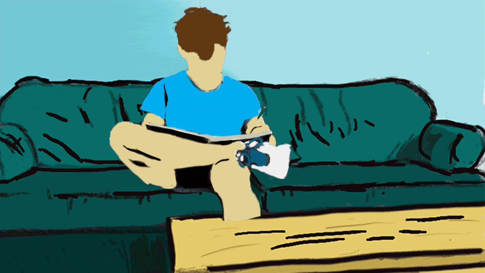
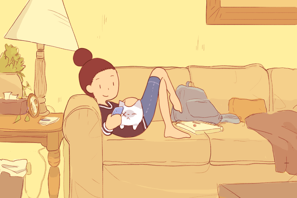
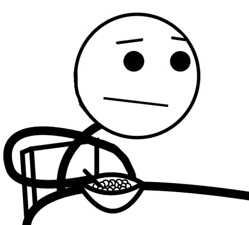
Considering that gifs are still thought of as "low art" since it is slightly new, and there is not really much time that they've existed, so there is a slight unsurety about how long they will last. There seems to be more time taken on some gifs rather than others, and I guess you can see the low art as something that can be a bit more dated, like an obviousness that this piece was marking a certain but short time period. I would think that the low art thing I picked was created in the early 2000's-2010's, since ragecomics were becoming a bit more popular in the rising popularity of facebook. The high art that I chose seems to be a bit more professional, done by someone who has a bit more experience with the software. I guess I consider the other piece low art because it was made towards a specific audience with a very specific purpose, only to be used for personal reasons but spread by so much media.
To be honest what is really high art and low art? I guess this is what the essay asks, but is there really much distinction. Going back to the 1700’s, you can consider the type of art they did as “pop culture” to them, since it was so well known. And even if there is such a difference, why is it considered “low art”? It brings a slightly negative connotation to it, in a way. Considerably, though, I can understand high art being pieces created more for the viewing purposes of inside a museum, while low art is spread other places, like internet, ads, and sometimes even commercials. I guess you can say that high art is a bit more conservative, in a way. Mass art seems to be the description of pop art. It is mass produced and spread to multiple mediums. Arguably, there is a downside to low art. After a while, it seems to die out faster, and change often. It seems to be always transformative, targeted to a younger population with a bit shorter attention span. I would think that high art is defined as something that lasts longer than its current time. That I can respect about high art, it is not driven by memes.
|
About the Artist
Hello, my name is Lee Sowell, and I am an aspiring artist who tries their hardest to be versatile. I specialize in animation, cartooning, and realistic portraits. I enjoy dark humor a lot of times. I have a very strong interest in freshwater fish, and currently own 15 fish (including a snail). I try my hardest to be open minded, and do not mind a critique once in a while. . Archives
June 2016
Categories |


 RSS Feed
